Tag: Business Intelligence

  • Data Visualization Techniques for Business Intelligence

    Data Visualization Techniques for Business Intelligence

    Data visualization techniques for business intelligence are revolutionizing how companies make decisions. Forget endless spreadsheets; imagine instantly understanding complex data through compelling visuals. This guide dives into the power of charts, dashboards, and advanced techniques, showing you how to transform raw data into actionable insights that drive growth and profitability. We’ll explore various methods, from simple bar charts to interactive dashboards and cutting-edge GIS applications, empowering you to make data-driven decisions with confidence.

    We’ll cover choosing the right visualization for your data, crafting effective visuals, and avoiding common pitfalls. Learn how to visualize key business metrics, from sales figures to customer behavior, and uncover hidden trends that can give your business a competitive edge. Get ready to unlock the potential of your data and turn information into a powerful asset.

    Introduction to Data Visualization in Business Intelligence

    Data visualization is no longer a luxury; it’s a necessity for businesses aiming to thrive in today’s competitive landscape. Effective data visualization transforms raw data into easily digestible insights, empowering businesses to make informed decisions, identify trends, and ultimately, boost their bottom line. Without it, crucial information can remain hidden, leading to missed opportunities and potentially costly mistakes.Effective data visualization is crucial for informed business decision-making.

    It allows stakeholders to quickly grasp complex information, identify patterns and anomalies, and communicate findings clearly and concisely. This accelerates the decision-making process, fostering a more agile and responsive business environment. By presenting data visually, organizations can move beyond simple reporting and engage in truly data-driven strategies.

    Misinterpretations from Poor Data Visualization

    Poorly designed visualizations can lead to inaccurate interpretations and flawed decisions. For example, a misleading bar chart with improperly scaled axes can exaggerate or downplay differences, leading to incorrect conclusions about market share or sales performance. Similarly, a pie chart with too many slices can be confusing and difficult to interpret, hindering the understanding of key proportions. A cluttered chart with excessive labels and distracting elements can overwhelm the viewer, obscuring the essential message within the data.

    Imagine a financial report using a 3D pie chart; the perspective distortion makes accurate comparison almost impossible. The resulting misinterpretations can range from minor inaccuracies to significant strategic errors.

    Benefits of Various Visualization Techniques in Business

    Different visualization techniques serve distinct purposes. Line charts effectively display trends over time, ideal for tracking sales figures or website traffic. Bar charts compare different categories, useful for analyzing product performance or customer demographics. Scatter plots reveal correlations between variables, helpful in understanding the relationship between advertising spend and sales revenue. Heatmaps are excellent for visualizing large datasets, identifying areas of high or low concentration, such as geographic sales data or customer satisfaction scores.

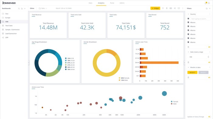
    Dashboards, combining multiple visualizations, provide a holistic overview of key performance indicators (KPIs), offering a comprehensive view of business health at a glance. For instance, a sales dashboard might incorporate line charts showing sales trends, bar charts comparing product performance, and geographical maps highlighting sales distribution. Choosing the appropriate visualization technique significantly enhances the clarity and impact of data presentation, facilitating better understanding and informed decision-making.

    Choosing the Right Visualization Technique

    Data visualization isn’t just about making your data look pretty; it’s about effectively communicating insights to your audience. Choosing the wrong chart type can obscure your message, leading to misinterpretations and ultimately, poor business decisions. Selecting the right visualization requires careful consideration of your data, your audience, and the story you want to tell.The effectiveness of your data visualization hinges on selecting the appropriate chart type.

    Different chart types excel at highlighting specific data characteristics. A poorly chosen chart can confuse rather than clarify, rendering your analysis useless. Understanding the strengths and weaknesses of various chart types is crucial for creating impactful visualizations.

    Chart Type Comparison

    The following table compares several common chart types, highlighting their suitability for different data characteristics. Remember, the “best” chart depends entirely on the context of your data and the message you’re aiming to convey.

    Chart Type Best for Showing Suitable Data Type Example Use Case
    Bar Chart Comparisons of categories Categorical data Comparing sales figures across different product lines.
    Line Chart Trends over time Time-series data Illustrating website traffic over a month.
    Pie Chart Proportions or percentages of a whole Categorical data representing parts of a whole Showing the market share of different competitors.
    Scatter Plot Correlations between two variables Numerical data Analyzing the relationship between advertising spend and sales revenue.

    Factors Influencing Chart Selection

    Choosing the right visualization technique involves more than just the data itself. Several key factors must be considered to ensure your visualization is both effective and impactful.Consider your audience’s familiarity with data visualization. A complex chart might confuse a non-technical audience, while a simple chart might be insufficient for experts. Similarly, the complexity of your data will influence your choice.

    Simple data might be adequately represented by a bar chart, while more complex datasets might require more sophisticated techniques like heatmaps or network graphs. Finally, the message you want to convey is paramount. Each chart type emphasizes different aspects of the data; choose the one that best highlights your key findings. For instance, if you want to show a clear trend over time, a line chart is ideal.

    If you need to compare the relative sizes of different categories, a bar chart would be more appropriate. The goal is to ensure the visualization directly supports your narrative and avoids misleading interpretations.

    Interactive Data Visualization

    Data visualization techniques for business intelligence

    Interactive data visualization is revolutionizing business intelligence, moving beyond static reports to create dynamic, engaging experiences that empower data-driven decision-making. Instead of passively consuming information, users can actively explore data, uncovering hidden insights and patterns that might otherwise be missed. This dynamic approach fosters a deeper understanding of complex data sets and facilitates more effective communication of key findings.Interactive dashboards, the heart of this revolution, offer a significant advantage by providing a centralized, real-time view of key performance indicators (KPIs).

    This allows businesses to monitor progress, identify trends, and respond quickly to changing market conditions. The ability to drill down into specific data points, filter information, and visualize relationships in multiple ways empowers users to gain a more comprehensive understanding of their data, fostering faster, more informed decisions.

    Interactive Visualization Tools and Their Functionalities

    Several powerful tools facilitate the creation and deployment of interactive dashboards. These tools offer a range of functionalities, from simple drag-and-drop interfaces to sophisticated programming capabilities, catering to various levels of technical expertise.Tableau, for example, is known for its user-friendly interface and powerful visualization capabilities. Users can easily connect to various data sources, create interactive dashboards with drag-and-drop functionality, and share their visualizations with others.

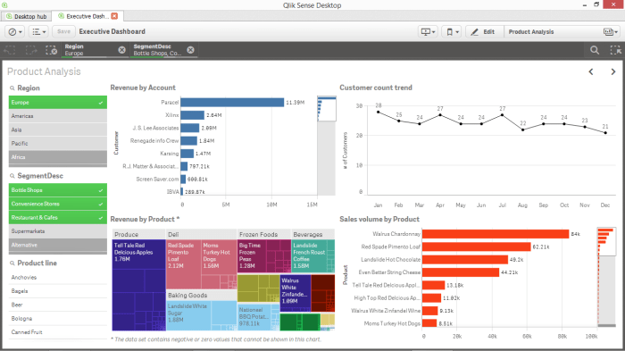
    Its functionality extends to advanced analytical features, enabling complex data exploration and insightful analysis. Power BI, another popular choice, offers similar capabilities, integrating seamlessly with Microsoft’s ecosystem. It provides robust data modeling, visualization, and reporting features, allowing businesses to create interactive dashboards that are tailored to their specific needs. Finally, Qlik Sense is renowned for its associative data exploration capabilities, allowing users to freely explore relationships between different data points and uncover hidden connections that might be missed with other tools.

    Each tool offers a unique blend of features, allowing businesses to select the best fit for their specific requirements and technical capabilities.

    Features of Effective Interactive Visualizations for Business Users

    The effectiveness of an interactive visualization hinges on several key features designed to enhance user experience and facilitate insightful analysis.A crucial aspect is the intuitive user interface. A clear, uncluttered design ensures that users can easily navigate the dashboard and understand the information presented. This includes clear labeling, consistent color schemes, and intuitive controls. Furthermore, interactivity itself is paramount.

    Users should be able to easily filter data, zoom in on specific areas, and drill down into details. The ability to customize views, selecting specific metrics and timeframes, is also crucial for tailoring the visualization to individual needs. Real-time data updates ensure that the information presented is always current and relevant, providing a dynamic and responsive view of business performance.

    Finally, the ability to easily share and collaborate on visualizations is vital for fostering data-driven decision-making across teams. This might involve the ability to export visualizations, embed them in reports, or share them directly with colleagues.

    Data Visualization Best Practices

    Crafting compelling data visualizations isn’t just about choosing the right chart; it’s about presenting information clearly and effectively, leading to better business decisions. Ignoring best practices can lead to misinterpretations and missed insights, undermining the entire purpose of your visualization. This section highlights key strategies for creating impactful visuals that truly tell your data’s story.Effective data visualization requires careful consideration of several key elements.

    Avoiding common pitfalls and adhering to established guidelines ensures your visualizations are not only visually appealing but also accurately represent your data and communicate your message clearly and concisely to your audience. The right techniques can transform complex datasets into easily digestible insights.

    Common Pitfalls in Data Visualization and Their Solutions

    Many common mistakes hinder the effectiveness of data visualizations. These issues range from cluttered charts to misleading scales and poor color choices. Addressing these problems proactively leads to much clearer and more impactful visualizations.

    • Over-cluttering: Too much information crammed into a single visualization overwhelms the viewer. Solution: Prioritize key data points and use multiple, smaller charts if necessary to avoid overwhelming the audience.
    • Misleading Scales: Truncated y-axes or inappropriate scaling can distort the perception of trends. Solution: Always start the y-axis at zero unless there’s a compelling reason not to. Clearly label axes and provide context for the scale used.
    • Poor Color Choices: Using too many colors or clashing hues makes the visualization difficult to interpret. Solution: Employ a limited color palette that is both visually appealing and supports data differentiation. Consider colorblind-friendly palettes.
    • Lack of Context: Visualizations without proper labels, titles, or notes leave the audience guessing. Solution: Always provide a clear title, axis labels, legends, and concise annotations to clarify the data presented.
    • Inappropriate Chart Type: Choosing the wrong chart type for the data can obscure trends or mislead the viewer. Solution: Select chart types appropriate to the type of data and the message you want to convey (e.g., bar charts for comparisons, line charts for trends, scatter plots for correlations).

    Guidelines for Creating Clear and Concise Visualizations

    Clear and concise visualizations are crucial for effective communication. These guidelines focus on simplifying the visual presentation of data, ensuring your audience can quickly grasp the key insights.

    Simplicity is key. Avoid unnecessary embellishments or details that distract from the main message. A well-designed visualization should be easy to understand at a glance. Use a clean, uncluttered design and a consistent style throughout the visualization. Consider the cognitive load on the viewer; the easier it is to process, the more effective the visualization will be.

    For example, a simple bar chart comparing sales figures across different regions is far more effective than a complex 3D pie chart showing the same data.

    Effective Use of Color, Labels, and Annotations, Data visualization techniques for business intelligence

    Color, labels, and annotations are powerful tools for enhancing visualization clarity. Used correctly, they can guide the viewer’s eye, highlight key data points, and improve understanding.

    For descriptions on additional topics like best business intelligence tools for small businesses, please visit the available best business intelligence tools for small businesses.

    Color should be used strategically to highlight important data points or group similar items. Avoid using too many colors, as this can be confusing. A consistent color scheme should be used throughout the visualization. For instance, using different shades of blue to represent various product categories helps maintain visual consistency. Labels should be clear, concise, and easy to read.

    They should accurately describe the data being presented. Annotations can be used to highlight specific data points or trends, providing additional context or explanation. For example, annotating a significant spike in sales with the relevant event (e.g., a marketing campaign) adds valuable context.

    Visualizing Key Business Metrics

    Data visualization techniques for business intelligence

    Data visualization isn’t just about pretty charts; it’s about translating complex business data into actionable insights. By effectively visualizing key performance indicators (KPIs), businesses can quickly identify trends, spot potential problems, and make data-driven decisions. This section explores how to effectively visualize crucial business metrics across various departments, focusing on best practices and providing illustrative examples.Effective visualization of key business metrics hinges on selecting the right chart type for the data and the message you want to convey.

    A poorly chosen chart can obscure insights, while a well-chosen one can illuminate critical trends and patterns instantly. This requires understanding your data, your audience, and the story you want to tell.

    KPIs Visualization Using Appropriate Chart Types

    Choosing the right chart type is paramount. For instance, line charts are ideal for showing trends over time, such as monthly sales figures or website traffic. Bar charts are perfect for comparing different categories, like sales performance across various product lines. Pie charts effectively illustrate proportions, such as market share or customer demographics. Dashboards often combine several chart types for a comprehensive overview.

    • Monthly Sales Performance: A line chart clearly displays sales trends over time, highlighting peaks and valleys, seasonal fluctuations, and overall growth. The X-axis represents months, and the Y-axis represents sales revenue. Adding a moving average line can help smooth out short-term fluctuations and reveal underlying trends more clearly.
    • Product Sales Comparison: A bar chart allows for a direct comparison of sales figures across different products. Each bar represents a product, and its height corresponds to its sales revenue. This instantly reveals which products are performing well and which need attention.
    • Customer Segmentation by Age: A pie chart effectively showcases the proportion of customers within different age groups. Each slice represents an age group, and its size reflects its percentage of the total customer base. This helps businesses tailor marketing strategies to specific demographics.

    Best Practices for Visualizing Financial, Sales, and Customer Data

    Visualizing financial, sales, and customer data requires careful consideration of the specific metrics and the desired outcome. Clear labeling, consistent scales, and a focus on key insights are crucial.

    • Financial Data: Use charts like line charts to track revenue, expenses, and profit over time. Consider using area charts to show the contribution of different revenue streams. Avoid cluttering charts with too much detail; focus on the most important metrics.
    • Sales Data: Bar charts are excellent for comparing sales performance across different regions, sales representatives, or product categories. Heatmaps can be used to visualize sales data across geographical areas, highlighting high-performing and underperforming regions.
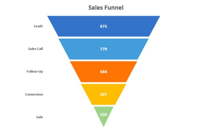
    • Customer Data: Pie charts and bar charts are useful for visualizing customer demographics and segmentation. Scatter plots can show the relationship between different customer attributes, such as purchase frequency and average order value. Funnel charts are excellent for visualizing the customer journey and identifying bottlenecks.

    Hypothetical Dashboard: E-commerce Business

    Let’s imagine an e-commerce business. A dashboard could effectively visualize key metrics like daily sales, website traffic, conversion rates, and average order value.

    Metric Visualization Description
    Daily Sales Line Chart Shows daily sales revenue over the past month, highlighting trends and peaks/valleys.
    Website Traffic Line Chart Displays website visits over the past month, broken down by source (organic, paid, social media).
    Conversion Rate Bar Chart Compares conversion rates across different marketing campaigns or website pages.
    Average Order Value Bar Chart Shows average order value over time, highlighting any changes in customer spending habits.
    Customer Acquisition Cost (CAC) Bar Chart Compares CAC across different marketing channels to identify cost-effective strategies.

    Advanced Visualization Techniques: Data Visualization Techniques For Business Intelligence

    Beyond basic charts and graphs, advanced visualization techniques unlock deeper insights from complex business data. These methods allow for the exploration of intricate relationships and patterns often hidden in large datasets, providing a more comprehensive understanding of business performance and opportunities. Mastering these techniques can significantly elevate your business intelligence capabilities.

    Geographic Information Systems (GIS) in Business Intelligence

    GIS applications offer powerful visualization capabilities for location-based data. By overlaying business data onto geographical maps, businesses can analyze spatial patterns and trends. For instance, a retail chain could use GIS to identify optimal locations for new stores based on population density, competitor proximity, and customer demographics. Visualizing sales data on a map allows for quick identification of high-performing and underperforming regions, enabling targeted marketing campaigns or resource allocation.

    The visual representation of this data allows for immediate identification of clusters and outliers, leading to more effective decision-making.

    Network Graphs for Complex Datasets

    Network graphs are ideal for visualizing relationships between different entities. Imagine a social media network, where nodes represent users and edges represent connections. Analyzing the network structure reveals influential users, communities, and information flow patterns. Similarly, in a supply chain, nodes could be suppliers, manufacturers, and distributors, with edges representing the flow of goods. Visualizing this network helps identify bottlenecks, vulnerabilities, and potential areas for improvement.

    The use of color-coding and node size can further enhance the visualization by highlighting key players or critical pathways. These visualizations provide a dynamic and insightful representation of complex interconnected systems.

    Heatmaps for Pattern Identification

    Heatmaps are excellent for visualizing patterns and trends in large datasets by using color gradients to represent data density or magnitude. For example, a heatmap could show customer activity on a website, with hotter colors indicating higher click-through rates or conversion rates. This allows for quick identification of popular pages or areas needing improvement. In finance, heatmaps can visualize correlations between different assets, revealing potential risks or investment opportunities.

    By effectively representing the magnitude of data points through color intensity, heatmaps provide an intuitive way to understand complex relationships and identify significant trends.

    Case Studies of Effective Data Visualization

    Data visualization techniques for business intelligence

    Data visualization isn’t just a pretty picture; it’s a powerful tool driving impactful business decisions across various sectors. Seeing the data, rather than just reading it, reveals hidden patterns, trends, and opportunities that can significantly boost efficiency and profitability. Let’s explore some compelling examples of how data visualization has transformed businesses.

    Effective data visualization translates complex datasets into easily digestible formats, fostering better understanding and faster, more informed decision-making. This leads to improved operational efficiency, enhanced customer experiences, and ultimately, a stronger bottom line. The following case studies showcase the transformative power of data visualization across different industries.

    Data Visualization in Retail: Optimizing Inventory Management

    A major clothing retailer implemented a sophisticated data visualization system to monitor inventory levels across its nationwide stores. By using interactive dashboards displaying real-time sales data, stock levels, and predicted demand, the company was able to identify slow-moving items and adjust ordering accordingly. This resulted in a significant reduction in warehousing costs and improved cash flow, as they minimized excess inventory and avoided stockouts of popular items.

    The visualization system provided a clear, holistic view of their inventory, eliminating guesswork and enabling data-driven decisions. The impact was a 15% reduction in inventory holding costs within the first year.

    Data Visualization in Healthcare: Improving Patient Outcomes

    A large hospital system utilized data visualization to analyze patient data, identifying trends in readmission rates. Interactive maps highlighted geographic areas with high readmission rates, allowing hospital administrators to pinpoint specific contributing factors, such as inadequate post-discharge care or insufficient patient education. By visualizing this data, the hospital developed targeted interventions, resulting in a 10% decrease in readmissions within six months.

    The improved patient outcomes also translated to cost savings for the hospital and improved patient satisfaction. The visualizations allowed for a granular understanding of patient journeys, revealing previously unseen bottlenecks and areas for improvement.

    Data Visualization in Finance: Detecting Fraudulent Transactions

    A financial institution implemented a real-time fraud detection system using data visualization. By displaying transaction data on interactive dashboards that highlighted unusual patterns and anomalies, the system alerted analysts to potentially fraudulent activities. The visual representation of transaction data, including location, amount, and timing, allowed analysts to quickly identify and investigate suspicious transactions, significantly reducing the time it took to detect and prevent fraudulent activities.

    This proactive approach resulted in a 20% reduction in fraudulent transactions and millions of dollars in cost savings. The system’s ability to visualize complex financial data in real-time proved invaluable in protecting the institution and its clients.

    The Future of Data Visualization in Business Intelligence

    Data visualization is rapidly evolving, driven by advancements in technology and the increasing demand for insightful, actionable intelligence from businesses of all sizes. The future promises even more immersive, interactive, and intelligent visualization tools, transforming how we understand and utilize data. This will lead to more effective decision-making and a competitive edge in the marketplace.The integration of cutting-edge technologies is reshaping the landscape of data visualization in business intelligence.

    We’re seeing a convergence of traditional techniques with emerging trends, creating powerful new approaches to data analysis and interpretation. This evolution offers both exciting opportunities and significant challenges for businesses.

    Augmented and Virtual Reality Applications in Data Visualization

    Augmented reality (AR) and virtual reality (VR) are poised to revolutionize how businesses interact with their data. Imagine wearing AR glasses that overlay key performance indicators (KPIs) directly onto a physical factory floor, allowing managers to instantly see production bottlenecks. Or consider a VR environment where executives can explore 3D models of sales data, gaining a more intuitive understanding of market trends and customer behavior.

    These immersive experiences offer unparalleled levels of engagement and insight, transforming complex datasets into easily digestible and actionable information. For instance, a company could use VR to simulate different marketing scenarios, visualizing the potential impact of various strategies on sales projections before implementing them in the real world. This allows for informed decision-making, reducing risks and maximizing ROI.

    Advancements in Visualization Techniques and Their Implications

    Several advancements are shaping the future of data visualization. Artificial intelligence (AI) is playing a crucial role, automating tasks such as data cleaning, feature extraction, and the selection of appropriate visualization techniques. AI-powered systems can even generate visualizations automatically, based on the characteristics of the data, saving analysts valuable time and effort. Furthermore, advancements in machine learning allow for more sophisticated predictive analytics, visualizing future trends and potential outcomes with greater accuracy.

    For example, a retail company could utilize AI-powered visualization to predict future customer demand based on past purchase patterns and external factors, allowing for optimized inventory management and reduced waste. This proactive approach, facilitated by advanced visualization, leads to improved efficiency and profitability.

    Challenges and Opportunities in Data Visualization for Business Intelligence

    While the future of data visualization is bright, several challenges need to be addressed. The increasing volume and complexity of data require more powerful and scalable visualization tools. Ensuring data security and privacy is also paramount, particularly with the use of cloud-based visualization platforms. Furthermore, the effective training and upskilling of employees to utilize these advanced tools are essential for maximizing their potential.

    However, the opportunities are vast. Data visualization can unlock valuable insights, leading to improved decision-making, increased efficiency, and a competitive advantage. The ability to effectively communicate complex data to diverse stakeholders, fostering collaboration and understanding, is a key driver of success in today’s data-driven world. Companies that embrace these advancements and address the associated challenges will be well-positioned to thrive in the future.

  • How to Use Business Intelligence for Competitive Advantage

    How to Use Business Intelligence for Competitive Advantage

    How to use business intelligence for competitive advantage? It’s the million-dollar question every forward-thinking business is grappling with. In today’s hyper-competitive landscape, leveraging data isn’t just a good idea—it’s a survival necessity. From identifying hidden market trends to crafting killer strategies, business intelligence (BI) offers a powerful toolkit for outmaneuvering rivals and securing lasting success. This deep dive will unpack how to harness the power of BI to gain a significant edge in your market.

    We’ll explore everything from identifying the right data sources and mastering analytical techniques to effectively communicating your findings and measuring the impact of your BI initiatives. Get ready to transform your business from data-driven to data-dominated!

    Defining Competitive Advantage Through Business Intelligence

    How to use business intelligence for competitive advantage

    In today’s hyper-competitive business landscape, gaining and maintaining a sustainable competitive advantage is paramount. Business intelligence (BI), the process of gathering, analyzing, and interpreting data to drive better business decisions, plays a crucial role in achieving this. By leveraging BI, companies can unlock hidden insights, anticipate market trends, and ultimately outperform their rivals. This section delves into how BI contributes to a lasting competitive edge.

    Business intelligence provides a sustainable competitive edge by enabling data-driven decision-making. Unlike traditional methods relying on intuition or gut feeling, BI utilizes hard data to inform strategic choices. This leads to more accurate predictions, improved resource allocation, and a more agile response to market changes. The ability to anticipate shifts in customer behavior, identify emerging opportunities, and mitigate potential threats is a significant advantage that only data-driven insights can provide.

    Examples of Companies Leveraging BI for Market Gains

    Several companies have demonstrated the transformative power of BI in achieving significant market gains. For instance, Amazon’s sophisticated recommendation engine, powered by vast amounts of customer data analysis, fuels its sales and enhances customer loyalty. Netflix utilizes BI to analyze viewing habits, predict future trends, and inform its content creation strategy, leading to its global dominance in the streaming industry.

    Similarly, Walmart’s use of BI for supply chain optimization and inventory management ensures efficient operations and minimizes waste, providing a cost advantage over competitors. These examples highlight the potential for BI to deliver tangible, market-leading results.

    Key Performance Indicators (KPIs) Relevant to Competitive Advantage

    Identifying and tracking the right KPIs is critical to measuring the effectiveness of BI initiatives and achieving a competitive advantage. Some of the most relevant KPIs include:

    Several key performance indicators (KPIs) are vital for measuring the impact of BI and its contribution to competitive advantage. These metrics provide a quantifiable assessment of success and guide strategic adjustments. For example, customer churn rate reveals the effectiveness of customer retention strategies, while market share reflects the company’s competitive positioning. Return on investment (ROI) of BI initiatives demonstrates its financial impact, and lead conversion rate highlights the efficiency of sales and marketing efforts.

    Finally, customer lifetime value (CLTV) provides a long-term perspective on customer profitability.

    Comparison of Traditional and BI-Driven Business Strategies

    The following table compares traditional business strategies with BI-enhanced approaches, highlighting the competitive advantages gained through data-driven decision-making.

    Strategy Traditional Approach BI-Enhanced Approach Competitive Advantage Gained
    Marketing Generic marketing campaigns based on assumptions and intuition. Targeted campaigns based on customer segmentation and behavior analysis, personalized messaging. Increased conversion rates, improved customer engagement, higher ROI on marketing spend.
    Sales Reactive sales processes, focusing on existing customers. Proactive sales strategies identifying high-potential leads, predictive sales forecasting. Increased sales volume, improved sales forecasting accuracy, higher win rates.
    Product Development Product development based on market research and expert opinions. Data-driven product development based on customer feedback, market trends, and competitive analysis. Faster time-to-market, improved product-market fit, higher customer satisfaction.
    Operations Manual processes, inefficient resource allocation. Automated processes, optimized resource allocation, real-time performance monitoring. Reduced operational costs, improved efficiency, enhanced productivity.

    Data Sources and Acquisition for Competitive Insights

    Unlocking a competitive edge hinges on leveraging the power of data. Business intelligence (BI) transforms raw information into actionable insights, but only if you’re sourcing the right data effectively. This section delves into identifying key data sources, integrating them seamlessly, and navigating the ethical considerations involved in competitive intelligence gathering.

    Effective data acquisition is a multi-faceted process. It requires a strategic approach encompassing both internal and external data sources, robust integration methods, and a keen awareness of ethical boundaries. Ignoring any of these aspects can severely limit the value of your BI initiatives and even expose your company to legal or reputational risks.

    Internal Data Sources for Competitive Analysis

    Internal data offers a wealth of information about your own operations, providing a crucial baseline for comparison against competitors. This includes sales figures, marketing campaign performance, customer feedback, operational efficiency metrics, and internal communications. Analyzing this data reveals areas of strength and weakness, informing strategic decisions and highlighting opportunities for improvement. For example, analyzing sales data segmented by product line can pinpoint high-performing products and identify areas needing further development.

    Similarly, analyzing customer feedback can highlight unmet needs, allowing for product innovation or service improvement to gain a competitive edge.

    External Data Sources for Competitive Analysis

    Beyond internal data, external sources provide a broader perspective on the competitive landscape. Market research reports offer valuable insights into industry trends, competitor strategies, and customer preferences. Publicly available financial statements of competitors reveal their financial health and investment priorities. Social media monitoring reveals customer sentiment and brand perception, allowing for proactive reputation management. Finally, news articles, industry publications, and patent filings can provide crucial information about competitor innovation and strategic moves.

    Analyzing competitor pricing strategies through publicly available information can inform your own pricing decisions, optimizing profitability while maintaining competitiveness.

    Data Integration and Cleansing Best Practices

    Integrating data from diverse sources is crucial for comprehensive competitive analysis. This involves consolidating data from various internal systems (CRM, ERP, marketing automation) and external sources (market research reports, social media data). Data cleansing is equally important; this process involves identifying and correcting inaccuracies, inconsistencies, and missing data points. Employing data quality tools and establishing standardized data formats are vital for accurate and reliable BI.

    For instance, ensuring consistent product naming conventions across all data sources prevents misinterpretations and improves the accuracy of sales analyses. Data validation rules can be implemented to automatically flag potential errors during the integration process.

    Ethical Considerations in Gathering and Using Competitive Data

    Ethical data acquisition is paramount. Competitive intelligence should be obtained through legal and ethical means, respecting privacy laws and intellectual property rights. Scraping data without consent is illegal and unethical. Information obtained through illicit means should never be used, even if seemingly beneficial. Instead, focus on publicly available data and information that is ethically and legally accessible.

    Transparency within your organization regarding data acquisition methods is crucial for maintaining ethical standards and building trust. For example, clearly defining what constitutes acceptable data collection methods in your company’s code of conduct will establish clear guidelines for employees.

    Data Acquisition Plan for a New Market Entry

    Imagine a hypothetical company, “InnovateTech,” entering the smart home automation market. Their data acquisition plan would involve:

    • Internal Data: Analyze existing customer data from related product lines to identify potential overlaps in customer demographics and preferences.
    • External Data: Conduct market research to identify key competitors, their market share, pricing strategies, and product features. Monitor social media conversations to understand customer sentiment towards existing smart home products.
    • Data Integration: Develop a centralized data warehouse to consolidate internal and external data. Implement data cleansing procedures to ensure data accuracy.
    • Ethical Considerations: Establish clear guidelines for data collection, ensuring compliance with privacy laws and ethical standards. Utilize only publicly available information and conduct all research legally.

    This structured approach enables InnovateTech to gain a competitive advantage by making informed decisions about product development, pricing, and marketing strategies.

    Analyzing Data for Competitive Intelligence

    Unlocking a competitive edge hinges on effectively analyzing the data you’ve gathered. This involves more than just looking at numbers; it’s about uncovering hidden patterns, predicting future trends, and ultimately, making informed business decisions that leave your competitors in the dust. This section delves into the techniques and tools that empower you to do just that.

    Analytical Techniques for Competitive Insights

    Extracting actionable insights requires a blend of quantitative and qualitative analysis. Quantitative analysis uses statistical methods to identify trends and correlations within numerical data. This could involve regression analysis to understand the relationship between marketing spend and sales, or time series analysis to forecast future demand. Qualitative analysis, on the other hand, involves interpreting non-numerical data such as customer reviews, competitor marketing materials, and news articles to understand the sentiment and context surrounding your market.

    Combining both approaches provides a holistic understanding of the competitive landscape. For example, analyzing sales data alongside customer feedback can reveal which product features are driving sales and which are causing customer dissatisfaction, leading to targeted product improvements.

    Data Visualization for Identifying Market Trends

    Data visualization is crucial for transforming raw data into easily digestible insights. Charts and graphs can reveal patterns and trends that might be missed when looking at spreadsheets alone. For instance, a line graph showing sales figures over time might reveal a seasonal trend, while a bar chart comparing market share across different competitors can highlight areas of strength and weakness.

    A heatmap visualizing customer demographics and purchasing behavior can identify key customer segments and their preferences. Consider a hypothetical scenario: a company visualizing customer location data on a map might notice a concentration of sales in a specific region, suggesting an opportunity for targeted marketing or even a new physical store location. This visual representation provides immediate clarity and actionable insights that a table of numbers alone cannot.

    Comparative Analysis of BI Tools

    Several Business Intelligence (BI) tools cater to different needs and budgets. Tableau, known for its user-friendly interface and powerful visualization capabilities, is ideal for quickly creating dashboards and exploring data interactively. Power BI, Microsoft’s offering, seamlessly integrates with other Microsoft products and provides robust reporting and data modeling features. Qlik Sense excels at associative data analysis, allowing users to explore connections between different data points effortlessly.

    The choice of tool depends on factors like the size and complexity of your data, your budget, and your team’s technical expertise. A smaller company with limited resources might find Tableau’s ease of use beneficial, while a larger enterprise with extensive data might opt for the scalability and advanced features of Power BI or Qlik Sense.

    Step-by-Step Competitive Analysis using BI

    Conducting a comprehensive competitive analysis using BI involves a structured approach:

    1. Define Objectives: Clearly Artikel the goals of your analysis. What specific questions are you trying to answer? Are you looking to identify new market opportunities, understand competitor strategies, or optimize pricing?
    2. Data Collection: Gather relevant data from various sources, including internal sales data, market research reports, competitor websites, and social media. Ensure data quality and consistency.
    3. Data Cleaning and Preparation: Cleanse and transform the data to ensure accuracy and consistency. This might involve handling missing values, standardizing data formats, and removing duplicates.
    4. Data Analysis: Employ appropriate analytical techniques, such as regression analysis, time series forecasting, and segmentation, to identify trends and patterns.
    5. Data Visualization: Create compelling visualizations, such as charts, graphs, and dashboards, to communicate insights effectively.
    6. Actionable Insights: Translate the findings into actionable strategies. Develop recommendations based on the analysis to improve your competitive position.

    Actionable Insights and Strategic Decision-Making

    Harnessing the power of business intelligence (BI) isn’t just about collecting data; it’s about transforming raw information into actionable strategies that propel your business forward. BI provides a clear view of your competitive landscape, revealing opportunities and threats you might otherwise miss. This allows for proactive, data-driven decision-making, significantly increasing your chances of success.BI-derived insights translate directly into tangible business strategies by providing a factual basis for informed choices.

    Instead of relying on gut feelings or guesswork, businesses can leverage data to optimize various aspects of their operations, from pricing and product development to marketing and customer service. This data-driven approach minimizes risk and maximizes return on investment.

    Pricing Strategies Informed by BI, How to use business intelligence for competitive advantage

    Effective pricing hinges on understanding market dynamics, customer behavior, and competitor actions. BI tools can analyze vast datasets to identify optimal pricing points that maximize revenue while maintaining competitiveness. For example, a company could use BI to analyze the price elasticity of demand for its product, revealing how sensitive customers are to price changes. This analysis would then inform a dynamic pricing strategy, adjusting prices based on real-time market conditions and customer segmentation.

    Imagine a subscription-based service using BI to identify customer segments willing to pay a premium for added features, enabling the creation of tiered pricing plans that optimize revenue.

    Product Development Guided by BI

    BI provides crucial insights into customer needs and preferences, enabling companies to develop products that resonate with their target market. By analyzing customer feedback, sales data, and market trends, businesses can identify gaps in the market and opportunities for innovation. For instance, a consumer goods company might use BI to analyze social media sentiment surrounding its products, identifying areas for improvement or new product ideas.

    Obtain access to What are the key features to look for when comparing different CRM systems to private resources that are additional.

    Analyzing sales data alongside customer demographics can pinpoint underserved segments, leading to the development of niche products tailored to specific customer needs. This approach reduces the risk of developing products that fail to meet market demand.

    Marketing Campaigns Optimized with BI

    BI plays a pivotal role in creating targeted and effective marketing campaigns. By analyzing customer demographics, purchasing history, and website behavior, businesses can segment their audience and tailor their messaging accordingly. This allows for personalized marketing experiences, leading to increased engagement and conversion rates. A retail company might utilize BI to analyze customer purchase patterns and preferences, enabling them to create highly targeted email campaigns promoting relevant products or services.

    Furthermore, analyzing website analytics can reveal which marketing channels are most effective, allowing for optimized resource allocation and improved ROI on marketing investments.

    Communicating BI Findings to Stakeholders

    Effectively communicating BI findings is crucial for ensuring that insights are translated into action. This involves creating clear, concise, and visually appealing presentations that highlight key findings and recommendations. The presentation should be tailored to the audience, using language and visuals that are easily understood. For example, a presentation to senior management might focus on high-level strategic implications, while a presentation to the marketing team might delve into more granular details.

    Hypothetical Competitive Analysis Presentation Summary

    A hypothetical competitive analysis of the coffee market might reveal that a specific competitor is gaining market share by focusing on sustainable sourcing and ethical labor practices. The presentation would summarize this finding, highlighting the competitor’s strategy and its impact on market dynamics. It would also include recommendations for responding to this competitive threat, such as investing in sustainable sourcing initiatives or highlighting the company’s own ethical practices.

    The presentation would utilize charts and graphs to visualize key data points, making the information easily digestible and impactful for the audience. This visual representation of the data strengthens the presentation’s impact and reinforces the strategic recommendations.

    Implementing and Managing a BI System for Competitive Advantage

    How to use business intelligence for competitive advantage

    Successfully implementing a Business Intelligence (BI) system isn’t just about acquiring the latest software; it’s about strategically integrating data analysis into the core of your business operations to gain a lasting competitive edge. A well-structured implementation plan, coupled with the right technological infrastructure and skilled personnel, is crucial for maximizing the return on investment and ensuring the system’s longevity.Key Elements of a Successful BI Implementation StrategyA successful BI implementation hinges on a well-defined strategy.

    This involves clearly articulating business objectives, identifying key performance indicators (KPIs), and selecting the appropriate BI tools and technologies. It also requires a phased approach, starting with a pilot project to test and refine the system before full-scale deployment. This iterative process allows for continuous improvement and adaptation based on feedback and evolving business needs. For example, a retail company might start by analyzing sales data from a single store before expanding to a regional or national level.

    This minimizes risk and allows for course correction early on.

    Technology and Human Capital in Maximizing BI Effectiveness

    Technology provides the backbone of any effective BI system. This includes data warehousing solutions for efficient data storage and retrieval, data visualization tools for creating insightful dashboards and reports, and advanced analytics platforms for predictive modeling and forecasting. However, technology alone is insufficient. Human capital, encompassing data analysts, business intelligence specialists, and data scientists, is crucial for interpreting data, identifying trends, and translating insights into actionable strategies.

    These professionals need the skills to not only use the BI tools but also to understand the business context and translate data into meaningful business decisions. Consider a scenario where a company invests in sophisticated AI-powered analytics but lacks personnel capable of interpreting the complex output; the investment becomes essentially wasted.

    Challenges Associated with Implementing and Maintaining a BI System

    Implementing and maintaining a BI system presents several challenges. Data integration from disparate sources can be complex and time-consuming, requiring significant effort to ensure data consistency and accuracy. Ensuring data security and privacy is paramount, necessitating robust security measures to protect sensitive information. Furthermore, maintaining the system requires ongoing investment in infrastructure, software updates, and personnel training. The lack of skilled personnel, coupled with high initial investment costs, often poses a major hurdle for smaller businesses.

    For instance, the cost of specialized software licenses and the need for ongoing technical support can be substantial, impacting smaller companies’ ability to adopt advanced BI systems.

    Comprehensive Training Program for Employees

    A comprehensive training program is vital to ensure employees can effectively utilize BI tools and interpret the insights generated. The program should be tailored to different user roles and skill levels, providing both technical training on software usage and business-oriented training on data interpretation and strategic decision-making. This can involve a combination of online courses, workshops, and on-the-job mentoring.

    For example, a training program could begin with introductory sessions focusing on basic data visualization and reporting, followed by advanced workshops on predictive modeling and forecasting for data analysts. Regular refresher courses and ongoing support should also be provided to maintain proficiency and address evolving needs.

    Measuring the Impact of Business Intelligence on Competitive Advantage: How To Use Business Intelligence For Competitive Advantage

    How to use business intelligence for competitive advantage

    Successfully implementing Business Intelligence (BI) isn’t just about collecting data; it’s about demonstrably improving your competitive standing. Measuring the impact of your BI initiatives is crucial to justifying continued investment and refining your strategies. This involves identifying key performance indicators (KPIs), tracking them effectively, and visualizing the results to showcase the return on investment (ROI).

    Key Metrics for Assessing BI Effectiveness

    Effective measurement requires focusing on metrics directly linked to business goals. Simply tracking data volume isn’t enough; you need to understand how that data translates into tangible benefits. The specific metrics will vary depending on your industry and business objectives, but some universally applicable KPIs include improved decision-making speed, reduced operational costs, and enhanced customer satisfaction. Focusing on these key areas allows for a comprehensive evaluation of the BI system’s contribution to the overall business strategy.

    Best Practices for Monitoring and Evaluating BI ROI

    Monitoring and evaluating the ROI of BI requires a structured approach. This includes establishing clear baseline metrics before implementing the BI system. This allows for a direct comparison and quantifiable demonstration of improvements post-implementation. Regular reporting and analysis are also vital, providing insights into areas for optimization and highlighting the ongoing value of the BI system. Regular reviews, perhaps quarterly or annually, should assess whether the BI system is meeting its objectives and if adjustments are needed.

    Tracking BI’s Impact on Key Business Outcomes

    The ultimate goal of BI is to improve key business outcomes. This could involve increased market share, improved profitability, enhanced customer retention, or faster product development cycles. Tracking these outcomes requires connecting BI-driven insights to specific actions and measuring the resulting changes. For example, if BI reveals a specific customer segment is underperforming, targeted marketing campaigns can be developed and their impact on sales and customer lifetime value can be meticulously tracked.

    This creates a direct line of sight between BI insights and bottom-line results.

    Dashboard Visualizing Key BI Success Metrics

    A well-designed dashboard provides a clear, concise overview of BI performance. This allows for quick identification of successes, areas needing improvement, and overall ROI. The following table provides an example of a BI success dashboard. Note that the specific metrics and targets will vary based on individual business needs.

    Metric Measurement Method Target Value Current Status
    Decision-Making Speed Time taken to make key strategic decisions (pre- and post-BI implementation) Reduce decision time by 25% Reduced by 20%
    Operational Efficiency Reduction in operational costs (e.g., inventory management, logistics) Reduce costs by 15% Reduced by 12%
    Customer Satisfaction Customer satisfaction scores (CSAT) and Net Promoter Score (NPS) Increase CSAT by 10 points, increase NPS by 5 points CSAT increased by 8 points, NPS increased by 3 points
    Market Share Market share percentage within the target segment Increase market share by 5% Increased by 3%
  • Effective Business Intelligence Dashboards and Reporting

    Effective Business Intelligence Dashboards and Reporting

    Effective business intelligence dashboards and reporting: Unlocking the power of data visualization! In today’s fast-paced business world, making informed decisions is crucial for success. This means turning raw data into actionable insights, and that’s where effective business intelligence (BI) dashboards and reporting come in. We’ll explore how to design dashboards that are clear, accurate, and user-friendly, transforming complex data into easily digestible information for everyone from executives to operational teams.

    Get ready to level up your data game!

    From choosing the right charts and graphs to understanding different reporting styles, we’ll cover everything you need to know to build compelling reports that tell a story. We’ll delve into the best practices for data visualization, emphasizing clarity and avoiding misleading representations. We’ll also look at how to integrate these dashboards and reports into your existing business processes, aligning them with your specific goals and objectives.

    Finally, we’ll discuss how to measure the effectiveness of your BI systems to ensure they’re truly driving business value.

    Defining Effective Business Intelligence Dashboards

    Effective business intelligence dashboards and reporting

    Business intelligence (BI) dashboards are more than just pretty charts and graphs; they’re powerful tools that transform raw data into actionable insights, driving better decision-making across an organization. An effective BI dashboard is a carefully crafted visual representation of key performance indicators (KPIs) and other relevant data, designed to provide a clear, concise, and readily understandable overview of business performance.

    It’s about presenting the right information to the right people at the right time.Effective BI dashboards are characterized by their clarity, accuracy, and ability to deliver actionable insights. Clarity ensures the information is easily understood, regardless of the user’s technical expertise. Accuracy is paramount; inaccurate data leads to flawed decisions. Actionable insights mean the dashboard provides information that allows users to identify problems, opportunities, and areas for improvement, ultimately influencing positive change within the business.

    A well-designed dashboard should not just present data, but tell a story, revealing trends, patterns, and anomalies that might otherwise be missed.

    Dashboard Design for Different Audiences

    Different stakeholders within an organization require different levels of detail and types of information. Executive dashboards, for example, typically focus on high-level summaries and key strategic indicators, while operational dashboards delve into more granular details and real-time data. Managerial dashboards fall somewhere in between, providing a more detailed view than executive dashboards but less granular than operational dashboards.

    Tailoring the dashboard to the specific needs and responsibilities of each audience is crucial for maximizing its effectiveness.

    Dashboard Type Key Metrics Target Audience Data Sources
    Executive Dashboard Revenue, Profit Margin, Customer Acquisition Cost, Market Share CEO, CFO, Board of Directors Sales CRM, Financial Reporting Systems, Market Research Data
    Managerial Dashboard Sales by Region, Customer Churn Rate, Marketing Campaign ROI, Employee Productivity Department Heads, Regional Managers, Marketing Managers Sales CRM, Marketing Automation Platforms, HR Systems, Operational Databases
    Operational Dashboard Real-time Inventory Levels, Order Fulfillment Rate, Production Efficiency, Customer Service Ticket Resolution Time Operations Managers, Production Supervisors, Customer Service Representatives ERP Systems, Supply Chain Management Systems, CRM, Help Desk Systems
    Financial Dashboard Cash Flow, Accounts Receivable, Accounts Payable, Profitability Ratios Finance Team, Accountants Accounting Software, Financial Reporting Systems

    User Experience (UX) in Dashboard Design

    User experience plays a pivotal role in the success of any BI dashboard. An intuitive and user-friendly design ensures that users can easily navigate the dashboard, quickly find the information they need, and understand the insights presented. Effective data visualization techniques, such as charts, graphs, and maps, are essential for presenting complex data in a clear and easily digestible format.

    Clear labeling, consistent color schemes, and appropriate use of whitespace contribute to a visually appealing and easy-to-understand dashboard. Poor UX, on the other hand, can lead to frustration, confusion, and ultimately, the underutilization of the dashboard. For example, a cluttered dashboard with too much information or poorly chosen visualizations can overwhelm users and make it difficult to extract meaningful insights.

    Conversely, a well-designed dashboard with clear navigation and effective data visualization can empower users to make data-driven decisions confidently and efficiently.

    Key Components of Effective Reporting

    Crafting compelling business intelligence reports is crucial for data-driven decision-making. Effective reporting goes beyond simply presenting numbers; it involves translating raw data into actionable insights that clearly communicate key performance indicators and drive strategic initiatives. This involves careful consideration of design, visualization, and the overall narrative.

    Effective reporting hinges on several key components. Choosing the right visualization method, understanding your audience, and structuring information logically are all essential for creating reports that are not only informative but also engaging and easily understood. A well-designed report should seamlessly guide the reader through the data, revealing patterns and trends that inform business strategy.

    Visualizations for Key Performance Indicators

    Visualizations are paramount in effective reporting, transforming complex data into easily digestible insights. A well-chosen chart or graph can instantly highlight trends and patterns that would be missed in a table of numbers. Consider this example:

    Sample Report: Quarterly Sales Performance

    Imagine a bar chart comparing quarterly sales figures for the past year. Each bar represents a quarter, with the height corresponding to the total sales revenue. A line graph could be overlaid on the bar chart, showing the trend line of sales over time. This combined visualization provides a clear picture of both individual quarterly performance and the overall sales trend.

    • KPI: Quarterly Sales Revenue: This measures the total revenue generated each quarter, indicating overall business performance and growth trajectory.
    • KPI: Year-over-Year Growth: This shows the percentage change in sales revenue compared to the same quarter in the previous year, highlighting growth or decline.
    • KPI: Average Order Value (AOV): This metric reflects the average amount spent per order, indicating customer spending habits and potential areas for improvement (e.g., upselling).

    Reporting Styles and Their Applications

    Different reporting styles cater to varying needs and audiences. Choosing the right style ensures the report’s message is effectively communicated. Three common styles are narrative, tabular, and graphical.

    Reporting Style Strengths Weaknesses Best Use Cases
    Narrative Provides context, explains trends, and offers insights; engages the reader. Can be lengthy and time-consuming to read; may lack precision for detailed analysis. Executive summaries, strategic reports, presentations.
    Tabular Highly precise and detailed; allows for easy comparison of specific data points. Can be overwhelming for large datasets; difficult to quickly identify trends. Detailed financial reports, inventory tracking, operational data.
    Graphical Quickly highlights trends and patterns; visually engaging and easy to understand. May lack detail; can be misleading if not properly designed or labeled. Performance dashboards, sales reports, presentations needing visual impact.

    Data Visualization Best Practices

    Effective data visualization is the cornerstone of any successful business intelligence dashboard. It transforms raw data into easily digestible insights, enabling quicker decision-making and a clearer understanding of complex business trends. Without clear and accurate visualizations, even the most robust data analysis can be rendered useless. The goal is to communicate information efficiently and avoid misinterpretations.Data visualization should prioritize clarity and accuracy above all else.

    Misleading charts can lead to flawed conclusions and detrimental business strategies. Therefore, selecting the appropriate chart type for the data is crucial, as is paying close attention to details like axis labeling, scale, and color choices.

    Choosing Appropriate Chart Types

    The selection of chart type directly impacts the effectiveness of your data visualization. Different chart types are better suited for different types of data and analytical goals. Choosing incorrectly can obscure insights or even present a false narrative.

    • Line charts are ideal for showing trends over time, particularly when displaying continuous data. For example, a line chart effectively illustrates monthly sales figures over a year, highlighting growth or decline patterns.
    • Bar charts are excellent for comparing different categories or groups. A bar chart could easily compare sales performance across different product lines or regions.
    • Pie charts are useful for showing the proportion of parts to a whole. However, they are best used with a limited number of categories (generally no more than 5-7) to avoid becoming cluttered and difficult to interpret.
    • Scatter plots are powerful tools for identifying correlations between two variables. A scatter plot could reveal the relationship between advertising spend and sales revenue.
    • Maps are effective for visualizing geographical data, such as sales distribution across different states or customer locations.

    Examples of Effective and Ineffective Visualizations

    Let’s examine some examples to illustrate the principles of effective and ineffective data visualization.

    Effective Visualization: A bar chart comparing the market share of three competing companies. The chart clearly labels each company, uses a consistent scale, and displays the data accurately. The color scheme is simple and easy to understand, making it easy to quickly grasp the relative market share of each competitor. This allows for immediate comparison and understanding of competitive landscape.

    Ineffective Visualization: A pie chart with more than 10 categories, each represented by a small slice. The chart is visually cluttered, making it difficult to distinguish between the different categories and understand their relative proportions. The small slices make it nearly impossible to interpret the data accurately, rendering the chart largely useless.

    Effective Visualization: A line chart showing the growth of a company’s revenue over five years. The chart uses a clear and consistent scale, labels the axes clearly, and includes a legend. The visual representation of the trend line makes it easy to identify periods of growth and decline, and to quickly assess the overall trajectory of the company’s financial performance.

    Ineffective Visualization: A 3D bar chart with distorted perspectives. The use of three dimensions makes it difficult to accurately compare the heights of the bars, leading to misinterpretations of the data. The added complexity does not improve understanding and actively hinders accurate data comprehension.

    Obtain access to how to choose the right RMM solution for remote monitoring and management needs to private resources that are additional.

    Integrating Dashboards and Reporting into Business Processes: Effective Business Intelligence Dashboards And Reporting

    Finereport reporting system roadmap decisions designing enabling

    Effective business intelligence (BI) dashboards and reports aren’t just static displays of data; they’re dynamic tools that should be seamlessly woven into the fabric of an organization’s operations. When properly integrated, they empower informed decision-making at all levels, from strategic planning in the C-suite to daily operational adjustments on the front lines. This integration, however, requires careful planning and execution to maximize its impact.Effective dashboards and reports significantly enhance decision-making across all organizational levels.

    Executive leadership gains a high-level overview of key performance indicators (KPIs), allowing for strategic adjustments and resource allocation. Mid-level managers can track departmental performance against targets, identify bottlenecks, and optimize processes. Finally, front-line employees benefit from access to real-time data, enabling them to make immediate, data-driven decisions that improve efficiency and customer satisfaction. For example, a sales team equipped with a dashboard showing real-time sales figures and customer interactions can immediately adjust their strategies to meet targets, while a manufacturing plant using dashboards to monitor production line efficiency can swiftly identify and address equipment malfunctions before they significantly impact output.

    Challenges in Implementing and Maintaining Effective BI Systems

    Implementing and maintaining effective BI dashboards and reporting systems presents several challenges. Data integration, often involving disparate systems and formats, requires significant effort and expertise. Ensuring data accuracy, consistency, and timeliness is crucial, demanding robust data governance procedures. Furthermore, providing adequate user training is essential to ensure that employees understand how to interpret the data presented and use the dashboards and reports effectively.

    Without proper training, the investment in BI tools will yield minimal returns. Consider a scenario where a company invests heavily in a sophisticated BI system but fails to train its employees on its use. The result would be underutilized resources and a lack of improvement in decision-making. The system becomes expensive shelfware, rather than a valuable asset.

    Aligning BI Dashboards and Reports with Business Goals

    Aligning BI dashboards and reports with specific business goals and objectives is critical for maximizing their value. This requires a clear understanding of the organization’s strategic priorities and translating them into measurable KPIs that are tracked and visualized on the dashboards. A step-by-step implementation plan can ensure a successful integration:

    1. Define Key Business Objectives: Clearly articulate the organization’s overarching goals and objectives. For example, increasing market share by 15% within the next year or improving customer satisfaction scores by 10 points.
    2. Identify Key Performance Indicators (KPIs): Determine the specific metrics that will measure progress toward these objectives. For example, to increase market share, relevant KPIs might include sales revenue, new customer acquisition rate, and market penetration.
    3. Data Source Identification and Integration: Identify the various data sources that contain the necessary information to calculate the KPIs. This might include CRM systems, sales data, marketing analytics, and financial records. Establish a robust data integration strategy to consolidate data from these diverse sources into a centralized repository.
    4. Dashboard and Report Design: Design dashboards and reports that clearly visualize the KPIs and provide actionable insights. Utilize effective data visualization techniques to ensure the information is easily understood and interpreted.
    5. User Training and Adoption: Provide comprehensive training to users on how to access, interpret, and utilize the dashboards and reports. Ensure that the system is user-friendly and intuitive to encourage adoption.
    6. Monitoring and Evaluation: Regularly monitor the performance of the BI system and evaluate its effectiveness in achieving business objectives. Make adjustments as needed to optimize the system and ensure its continued relevance.

    Measuring the Effectiveness of BI Dashboards and Reporting

    Effective business intelligence dashboards and reporting

    Building effective business intelligence (BI) dashboards and reports isn’t just about creating visually appealing displays; it’s about driving tangible business improvements. Measuring the effectiveness of your BI initiatives is crucial to ensure they’re delivering real value and justifying the investment. This involves a multifaceted approach that combines quantitative and qualitative data to paint a complete picture of impact.Effective measurement strategies allow businesses to identify areas for improvement, optimize resource allocation, and ultimately demonstrate the ROI of their BI investments.

    Without proper evaluation, your organization risks creating dashboards and reports that remain underutilized, providing little to no impact on decision-making processes.

    User Feedback Surveys

    Gathering user feedback is essential to understand the usability and perceived value of your BI dashboards and reports. Surveys can be implemented using various methods, from simple email questionnaires to more sophisticated online survey tools. These surveys should target the key users of the BI system, gathering feedback on aspects such as data accuracy, ease of navigation, report clarity, and the overall usefulness of the information presented.

    Effective surveys include both quantitative (e.g., rating scales) and qualitative (e.g., open-ended questions) elements to capture a holistic perspective. For example, a survey might ask users to rate the clarity of the dashboards on a scale of 1 to 5, and then provide an open-ended question allowing them to elaborate on specific aspects they found helpful or confusing.

    Analyzing the responses will reveal areas for improvement in design, content, or functionality.

    Key Performance Indicator (KPI) Tracking

    KPIs are critical metrics that reflect the success of your business objectives. Linking your BI dashboards and reports directly to these KPIs provides a quantitative measure of their impact. For instance, if a key goal is to increase sales conversion rates, the dashboard should clearly display this metric, along with relevant contributing factors. Tracking changes in KPIs over time, both before and after the implementation of new BI tools, demonstrates the effectiveness of the system in driving improvements.

    A clear correlation between improvements in KPIs and the use of BI tools provides strong evidence of their value. For example, if sales conversion rates increased by 15% after implementing a new sales dashboard that provided real-time sales performance data, this would be strong evidence of the dashboard’s effectiveness.

    Hypothetical Scenario: Implementing a New BI Dashboard

    Imagine a retail company implementing a new BI dashboard designed to track inventory levels and predict future demand. Before implementation, the company experienced frequent stockouts and overstocking, leading to lost sales and increased storage costs. To measure the impact of the new dashboard, the company would track several KPIs: inventory turnover rate, stockout frequency, storage costs, and ultimately, overall profitability.

    By comparing these KPIs before and after the dashboard’s implementation, the company can quantify the improvement in efficiency and profitability directly attributed to the BI tool. They could also conduct post-implementation user surveys to assess user satisfaction and identify areas for further optimization. The success of the dashboard would be measured by demonstrable improvements in these KPIs and positive user feedback.

    Data Collection Plan for Assessing BI System Effectiveness, Effective business intelligence dashboards and reporting

    A comprehensive data collection plan should incorporate both quantitative and qualitative data points to provide a complete picture of the BI system’s effectiveness.

    Metric Category Specific Metric Data Collection Method
    User Engagement Dashboard login frequency System logs
    User Engagement Time spent on dashboards System logs
    User Engagement Number of reports downloaded/exported System logs
    User Engagement User feedback survey responses Online surveys
    Decision-Making Improvements Changes in key performance indicators (KPIs) Data warehouse
    Decision-Making Improvements Reduction in time spent on data analysis Time studies/user surveys
    Decision-Making Improvements Improved accuracy of forecasting Comparison of forecasts with actual results

    This data collection plan provides a structured approach to gathering the necessary information to assess the effectiveness of the BI system, ensuring a thorough and comprehensive evaluation.