Effective business intelligence dashboards and reporting: Unlocking the power of data visualization! In today’s fast-paced business world, making informed decisions is crucial for success. This means turning raw data into actionable insights, and that’s where effective business intelligence (BI) dashboards and reporting come in. We’ll explore how to design dashboards that are clear, accurate, and user-friendly, transforming complex data into easily digestible information for everyone from executives to operational teams.
Get ready to level up your data game!
From choosing the right charts and graphs to understanding different reporting styles, we’ll cover everything you need to know to build compelling reports that tell a story. We’ll delve into the best practices for data visualization, emphasizing clarity and avoiding misleading representations. We’ll also look at how to integrate these dashboards and reports into your existing business processes, aligning them with your specific goals and objectives.
Finally, we’ll discuss how to measure the effectiveness of your BI systems to ensure they’re truly driving business value.
Defining Effective Business Intelligence Dashboards
Business intelligence (BI) dashboards are more than just pretty charts and graphs; they’re powerful tools that transform raw data into actionable insights, driving better decision-making across an organization. An effective BI dashboard is a carefully crafted visual representation of key performance indicators (KPIs) and other relevant data, designed to provide a clear, concise, and readily understandable overview of business performance.
It’s about presenting the right information to the right people at the right time.Effective BI dashboards are characterized by their clarity, accuracy, and ability to deliver actionable insights. Clarity ensures the information is easily understood, regardless of the user’s technical expertise. Accuracy is paramount; inaccurate data leads to flawed decisions. Actionable insights mean the dashboard provides information that allows users to identify problems, opportunities, and areas for improvement, ultimately influencing positive change within the business.
A well-designed dashboard should not just present data, but tell a story, revealing trends, patterns, and anomalies that might otherwise be missed.
Dashboard Design for Different Audiences
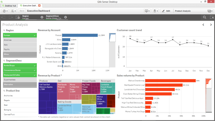
Different stakeholders within an organization require different levels of detail and types of information. Executive dashboards, for example, typically focus on high-level summaries and key strategic indicators, while operational dashboards delve into more granular details and real-time data. Managerial dashboards fall somewhere in between, providing a more detailed view than executive dashboards but less granular than operational dashboards.
Tailoring the dashboard to the specific needs and responsibilities of each audience is crucial for maximizing its effectiveness.
| Dashboard Type | Key Metrics | Target Audience | Data Sources |
|---|---|---|---|
| Executive Dashboard | Revenue, Profit Margin, Customer Acquisition Cost, Market Share | CEO, CFO, Board of Directors | Sales CRM, Financial Reporting Systems, Market Research Data |
| Managerial Dashboard | Sales by Region, Customer Churn Rate, Marketing Campaign ROI, Employee Productivity | Department Heads, Regional Managers, Marketing Managers | Sales CRM, Marketing Automation Platforms, HR Systems, Operational Databases |
| Operational Dashboard | Real-time Inventory Levels, Order Fulfillment Rate, Production Efficiency, Customer Service Ticket Resolution Time | Operations Managers, Production Supervisors, Customer Service Representatives | ERP Systems, Supply Chain Management Systems, CRM, Help Desk Systems |
| Financial Dashboard | Cash Flow, Accounts Receivable, Accounts Payable, Profitability Ratios | Finance Team, Accountants | Accounting Software, Financial Reporting Systems |
User Experience (UX) in Dashboard Design
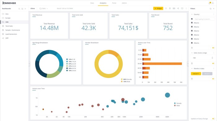
User experience plays a pivotal role in the success of any BI dashboard. An intuitive and user-friendly design ensures that users can easily navigate the dashboard, quickly find the information they need, and understand the insights presented. Effective data visualization techniques, such as charts, graphs, and maps, are essential for presenting complex data in a clear and easily digestible format.
Clear labeling, consistent color schemes, and appropriate use of whitespace contribute to a visually appealing and easy-to-understand dashboard. Poor UX, on the other hand, can lead to frustration, confusion, and ultimately, the underutilization of the dashboard. For example, a cluttered dashboard with too much information or poorly chosen visualizations can overwhelm users and make it difficult to extract meaningful insights.
Conversely, a well-designed dashboard with clear navigation and effective data visualization can empower users to make data-driven decisions confidently and efficiently.
Key Components of Effective Reporting
Crafting compelling business intelligence reports is crucial for data-driven decision-making. Effective reporting goes beyond simply presenting numbers; it involves translating raw data into actionable insights that clearly communicate key performance indicators and drive strategic initiatives. This involves careful consideration of design, visualization, and the overall narrative.
Effective reporting hinges on several key components. Choosing the right visualization method, understanding your audience, and structuring information logically are all essential for creating reports that are not only informative but also engaging and easily understood. A well-designed report should seamlessly guide the reader through the data, revealing patterns and trends that inform business strategy.
Visualizations for Key Performance Indicators
Visualizations are paramount in effective reporting, transforming complex data into easily digestible insights. A well-chosen chart or graph can instantly highlight trends and patterns that would be missed in a table of numbers. Consider this example:
Sample Report: Quarterly Sales Performance
Imagine a bar chart comparing quarterly sales figures for the past year. Each bar represents a quarter, with the height corresponding to the total sales revenue. A line graph could be overlaid on the bar chart, showing the trend line of sales over time. This combined visualization provides a clear picture of both individual quarterly performance and the overall sales trend.
- KPI: Quarterly Sales Revenue: This measures the total revenue generated each quarter, indicating overall business performance and growth trajectory.
- KPI: Year-over-Year Growth: This shows the percentage change in sales revenue compared to the same quarter in the previous year, highlighting growth or decline.
- KPI: Average Order Value (AOV): This metric reflects the average amount spent per order, indicating customer spending habits and potential areas for improvement (e.g., upselling).
Reporting Styles and Their Applications
Different reporting styles cater to varying needs and audiences. Choosing the right style ensures the report’s message is effectively communicated. Three common styles are narrative, tabular, and graphical.
| Reporting Style | Strengths | Weaknesses | Best Use Cases |
|---|---|---|---|
| Narrative | Provides context, explains trends, and offers insights; engages the reader. | Can be lengthy and time-consuming to read; may lack precision for detailed analysis. | Executive summaries, strategic reports, presentations. |
| Tabular | Highly precise and detailed; allows for easy comparison of specific data points. | Can be overwhelming for large datasets; difficult to quickly identify trends. | Detailed financial reports, inventory tracking, operational data. |
| Graphical | Quickly highlights trends and patterns; visually engaging and easy to understand. | May lack detail; can be misleading if not properly designed or labeled. | Performance dashboards, sales reports, presentations needing visual impact. |
Data Visualization Best Practices
Effective data visualization is the cornerstone of any successful business intelligence dashboard. It transforms raw data into easily digestible insights, enabling quicker decision-making and a clearer understanding of complex business trends. Without clear and accurate visualizations, even the most robust data analysis can be rendered useless. The goal is to communicate information efficiently and avoid misinterpretations.Data visualization should prioritize clarity and accuracy above all else.
Misleading charts can lead to flawed conclusions and detrimental business strategies. Therefore, selecting the appropriate chart type for the data is crucial, as is paying close attention to details like axis labeling, scale, and color choices.
Choosing Appropriate Chart Types
The selection of chart type directly impacts the effectiveness of your data visualization. Different chart types are better suited for different types of data and analytical goals. Choosing incorrectly can obscure insights or even present a false narrative.
- Line charts are ideal for showing trends over time, particularly when displaying continuous data. For example, a line chart effectively illustrates monthly sales figures over a year, highlighting growth or decline patterns.
- Bar charts are excellent for comparing different categories or groups. A bar chart could easily compare sales performance across different product lines or regions.
- Pie charts are useful for showing the proportion of parts to a whole. However, they are best used with a limited number of categories (generally no more than 5-7) to avoid becoming cluttered and difficult to interpret.
- Scatter plots are powerful tools for identifying correlations between two variables. A scatter plot could reveal the relationship between advertising spend and sales revenue.
- Maps are effective for visualizing geographical data, such as sales distribution across different states or customer locations.
Examples of Effective and Ineffective Visualizations
Let’s examine some examples to illustrate the principles of effective and ineffective data visualization.
Effective Visualization: A bar chart comparing the market share of three competing companies. The chart clearly labels each company, uses a consistent scale, and displays the data accurately. The color scheme is simple and easy to understand, making it easy to quickly grasp the relative market share of each competitor. This allows for immediate comparison and understanding of competitive landscape.
Ineffective Visualization: A pie chart with more than 10 categories, each represented by a small slice. The chart is visually cluttered, making it difficult to distinguish between the different categories and understand their relative proportions. The small slices make it nearly impossible to interpret the data accurately, rendering the chart largely useless.
Effective Visualization: A line chart showing the growth of a company’s revenue over five years. The chart uses a clear and consistent scale, labels the axes clearly, and includes a legend. The visual representation of the trend line makes it easy to identify periods of growth and decline, and to quickly assess the overall trajectory of the company’s financial performance.
Ineffective Visualization: A 3D bar chart with distorted perspectives. The use of three dimensions makes it difficult to accurately compare the heights of the bars, leading to misinterpretations of the data. The added complexity does not improve understanding and actively hinders accurate data comprehension.
Obtain access to how to choose the right RMM solution for remote monitoring and management needs to private resources that are additional.
Integrating Dashboards and Reporting into Business Processes: Effective Business Intelligence Dashboards And Reporting

Effective business intelligence (BI) dashboards and reports aren’t just static displays of data; they’re dynamic tools that should be seamlessly woven into the fabric of an organization’s operations. When properly integrated, they empower informed decision-making at all levels, from strategic planning in the C-suite to daily operational adjustments on the front lines. This integration, however, requires careful planning and execution to maximize its impact.Effective dashboards and reports significantly enhance decision-making across all organizational levels.
Executive leadership gains a high-level overview of key performance indicators (KPIs), allowing for strategic adjustments and resource allocation. Mid-level managers can track departmental performance against targets, identify bottlenecks, and optimize processes. Finally, front-line employees benefit from access to real-time data, enabling them to make immediate, data-driven decisions that improve efficiency and customer satisfaction. For example, a sales team equipped with a dashboard showing real-time sales figures and customer interactions can immediately adjust their strategies to meet targets, while a manufacturing plant using dashboards to monitor production line efficiency can swiftly identify and address equipment malfunctions before they significantly impact output.
Challenges in Implementing and Maintaining Effective BI Systems
Implementing and maintaining effective BI dashboards and reporting systems presents several challenges. Data integration, often involving disparate systems and formats, requires significant effort and expertise. Ensuring data accuracy, consistency, and timeliness is crucial, demanding robust data governance procedures. Furthermore, providing adequate user training is essential to ensure that employees understand how to interpret the data presented and use the dashboards and reports effectively.
Without proper training, the investment in BI tools will yield minimal returns. Consider a scenario where a company invests heavily in a sophisticated BI system but fails to train its employees on its use. The result would be underutilized resources and a lack of improvement in decision-making. The system becomes expensive shelfware, rather than a valuable asset.
Aligning BI Dashboards and Reports with Business Goals
Aligning BI dashboards and reports with specific business goals and objectives is critical for maximizing their value. This requires a clear understanding of the organization’s strategic priorities and translating them into measurable KPIs that are tracked and visualized on the dashboards. A step-by-step implementation plan can ensure a successful integration:
- Define Key Business Objectives: Clearly articulate the organization’s overarching goals and objectives. For example, increasing market share by 15% within the next year or improving customer satisfaction scores by 10 points.
- Identify Key Performance Indicators (KPIs): Determine the specific metrics that will measure progress toward these objectives. For example, to increase market share, relevant KPIs might include sales revenue, new customer acquisition rate, and market penetration.
- Data Source Identification and Integration: Identify the various data sources that contain the necessary information to calculate the KPIs. This might include CRM systems, sales data, marketing analytics, and financial records. Establish a robust data integration strategy to consolidate data from these diverse sources into a centralized repository.
- Dashboard and Report Design: Design dashboards and reports that clearly visualize the KPIs and provide actionable insights. Utilize effective data visualization techniques to ensure the information is easily understood and interpreted.
- User Training and Adoption: Provide comprehensive training to users on how to access, interpret, and utilize the dashboards and reports. Ensure that the system is user-friendly and intuitive to encourage adoption.
- Monitoring and Evaluation: Regularly monitor the performance of the BI system and evaluate its effectiveness in achieving business objectives. Make adjustments as needed to optimize the system and ensure its continued relevance.
Measuring the Effectiveness of BI Dashboards and Reporting
Building effective business intelligence (BI) dashboards and reports isn’t just about creating visually appealing displays; it’s about driving tangible business improvements. Measuring the effectiveness of your BI initiatives is crucial to ensure they’re delivering real value and justifying the investment. This involves a multifaceted approach that combines quantitative and qualitative data to paint a complete picture of impact.Effective measurement strategies allow businesses to identify areas for improvement, optimize resource allocation, and ultimately demonstrate the ROI of their BI investments.
Without proper evaluation, your organization risks creating dashboards and reports that remain underutilized, providing little to no impact on decision-making processes.
User Feedback Surveys
Gathering user feedback is essential to understand the usability and perceived value of your BI dashboards and reports. Surveys can be implemented using various methods, from simple email questionnaires to more sophisticated online survey tools. These surveys should target the key users of the BI system, gathering feedback on aspects such as data accuracy, ease of navigation, report clarity, and the overall usefulness of the information presented.
Effective surveys include both quantitative (e.g., rating scales) and qualitative (e.g., open-ended questions) elements to capture a holistic perspective. For example, a survey might ask users to rate the clarity of the dashboards on a scale of 1 to 5, and then provide an open-ended question allowing them to elaborate on specific aspects they found helpful or confusing.
Analyzing the responses will reveal areas for improvement in design, content, or functionality.
Key Performance Indicator (KPI) Tracking
KPIs are critical metrics that reflect the success of your business objectives. Linking your BI dashboards and reports directly to these KPIs provides a quantitative measure of their impact. For instance, if a key goal is to increase sales conversion rates, the dashboard should clearly display this metric, along with relevant contributing factors. Tracking changes in KPIs over time, both before and after the implementation of new BI tools, demonstrates the effectiveness of the system in driving improvements.
A clear correlation between improvements in KPIs and the use of BI tools provides strong evidence of their value. For example, if sales conversion rates increased by 15% after implementing a new sales dashboard that provided real-time sales performance data, this would be strong evidence of the dashboard’s effectiveness.
Hypothetical Scenario: Implementing a New BI Dashboard
Imagine a retail company implementing a new BI dashboard designed to track inventory levels and predict future demand. Before implementation, the company experienced frequent stockouts and overstocking, leading to lost sales and increased storage costs. To measure the impact of the new dashboard, the company would track several KPIs: inventory turnover rate, stockout frequency, storage costs, and ultimately, overall profitability.
By comparing these KPIs before and after the dashboard’s implementation, the company can quantify the improvement in efficiency and profitability directly attributed to the BI tool. They could also conduct post-implementation user surveys to assess user satisfaction and identify areas for further optimization. The success of the dashboard would be measured by demonstrable improvements in these KPIs and positive user feedback.
Data Collection Plan for Assessing BI System Effectiveness, Effective business intelligence dashboards and reporting
A comprehensive data collection plan should incorporate both quantitative and qualitative data points to provide a complete picture of the BI system’s effectiveness.
| Metric Category | Specific Metric | Data Collection Method |
|---|---|---|
| User Engagement | Dashboard login frequency | System logs |
| User Engagement | Time spent on dashboards | System logs |
| User Engagement | Number of reports downloaded/exported | System logs |
| User Engagement | User feedback survey responses | Online surveys |
| Decision-Making Improvements | Changes in key performance indicators (KPIs) | Data warehouse |
| Decision-Making Improvements | Reduction in time spent on data analysis | Time studies/user surveys |
| Decision-Making Improvements | Improved accuracy of forecasting | Comparison of forecasts with actual results |
This data collection plan provides a structured approach to gathering the necessary information to assess the effectiveness of the BI system, ensuring a thorough and comprehensive evaluation.